Bringing data to life: Telling better stories with Infographics

“It feels like we’re all suffering from information overload or data glut—and the good news is that there may be an easy solution to that—and that’s using our eyes more. Visualizing information so we can see the patterns and connections that matter. And then designing that information so it makes sense, or tells a story or allows us to focus only on the information that’s important”.
-David McCandless on TED.com
The Department of Family and Community Medicine at the University of Toronto (DFCM) is one of the largest Family Medicine teaching departments in North America and possibly the world. And it’s still growing.
The Department’s success stems from its unbridled commitment to the primary care needs of its growing community, as well as to the advancement of family medicine itself.
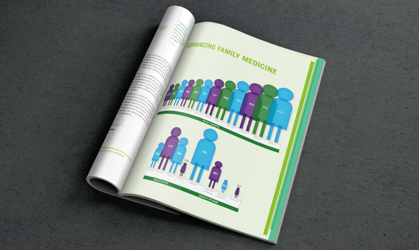
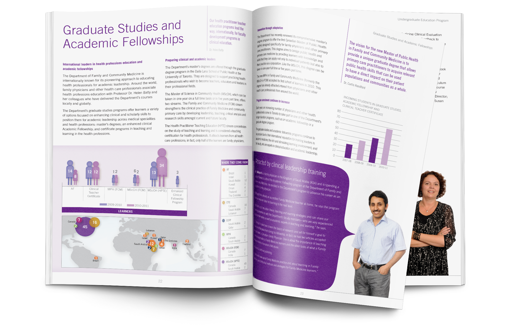
Their recent achievements presented in their report, Advancing Family Medicine, written by DFCM and designed by Neglia Design, prominently featured infographics that highlighted key accomplishments and statistics throughout the report.
How well can visuals tell a story?
Here are just a few of the key infographics from the Report that highlight the Department’s journey for the past two years (and before that). See if you can get a sense of the sheer scale and nature of DFCM and their many accomplishments—all through the power of visuals.


 7 ways visual communication design helps enhance corporate communications
  COVID-19 Communication Services and Graphic Design
  Three reasons why your website needs an SSL Certificate
  The Met releases 375,000 beautiful images for free and unrestricted use